




I spent time with LA NACION as a daily news app, paying particular attention to how comfortably it works for people with different reading habits, motor abilities, attention levels, and everyday constraints. Developed by LA NACION, it belongs to the News & Magazines category and is free to use. Its purpose is straightforward: bring the publication’s news experience to a phone in a way that feels quicker than opening a browser and searching for the latest stories.
That simplicity is both its strongest quality and its main limitation. If you already want LA NACION’s reporting, the app gives you a focused place to read it. If you are looking for a broad, highly customizable news reader that combines many publications, it may feel narrower than an aggregator. My overall impression is that it works best as a direct connection to one newspaper rather than as a complete replacement for every source in a person’s news routine.
How clearly the app supports different readers
Readability and navigation for a daily news check
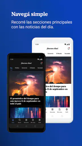
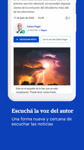
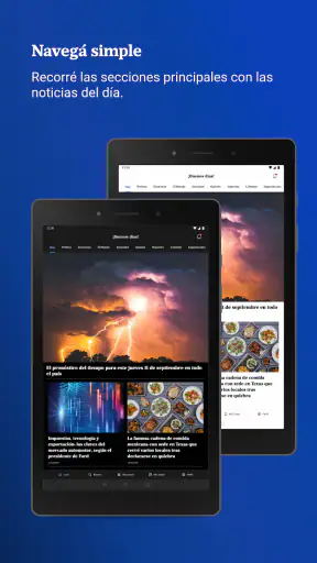
The most useful part of the experience is the directness of the news flow. Instead of dealing with a general web page full of unrelated browser controls, I can open the application and move into the publication’s content. That matters when I only have a few minutes, such as during a commute, before an appointment, or while waiting for dinner to finish. The store summary describes the goal as finding important news quickly, and that is the right way to understand the product: it is designed for a fast editorial check rather than an elaborate reading workspace.
For me, readable navigation begins with knowing what I am looking at. A newspaper app has a clear advantage over a social feed because stories are presented as news items rather than mixed with personal posts, comments, and unrelated recommendations. That can reduce the mental effort involved in deciding where to tap next. On the other hand, readers who follow several subjects at once may need to spend more time moving through the publication’s organization to find a particular topic.
I would recommend opening the app with a purpose instead of treating it as an endless feed. For example, I might first scan the main headlines, then choose one section that matters to me, and stop after reading the articles relevant to the day. This small habit makes the experience more manageable for people who find dense news feeds tiring. It also helps avoid confusing “quick access” with “read everything.”
The interface is most comfortable when I give each article my full attention. News pages naturally contain headlines, images, labels, and blocks of text, so even a well-organized screen can become visually demanding. Readers who prefer large text should check how the current version, 19.19.0, behaves with their phone’s text-size settings. The app supports devices starting with operating system 7.1, which makes it available to people using older phones, although the exact comfort of reading will still depend on the device and its display.
One practical advantage of using a dedicated publication app is consistency. I do not have to remember a website address or search for the newspaper each time. That is especially helpful for someone who is less comfortable with browser tabs, address bars, or search results. A person assisting an older relative could also begin by placing the app in an easy-to-find location on the home screen and explaining one simple routine: open it, scan the headlines, tap a story, and use the device’s normal back control to return.
Motor and sensory considerations in ordinary use
News reading is often treated as a passive activity, but it still involves repeated small movements: tapping headlines, scrolling through long articles, returning to the previous screen, and sometimes dismissing interruptions. For a reader with limited dexterity or tremor, a layout that asks for precise taps can be more tiring than it appears. My advice is to use deliberate, slower gestures rather than trying to move rapidly between stories. The app is more useful as a calm reading tool than as something to operate at high speed.
People with reduced vision may find the phone’s built-in display controls important. Increasing system text size, adjusting contrast where the operating system allows it, and choosing a comfortable brightness level can make a bigger difference than any individual app setting. These adjustments can also affect how much content is visible at once, so there is a trade-off: larger text improves legibility, but it may require more scrolling and make headline scanning less efficient.
That trade-off is worth accepting. The point of a news app is not to show the maximum number of headlines on one screen; it is to help the reader understand what matters. I would rather read fewer items comfortably than strain to scan a crowded page. Readers sensitive to bright screens should also consider using the phone’s own night or dimming features when reading in the evening, while remembering that very low brightness can make text harder to distinguish in a dark room.
For people with hearing loss, the main value of a text-based news app is that its essential experience does not depend on listening to a broadcast. Someone can follow written reporting without needing audio. That does not automatically mean every media element will be equally accessible, so I would treat the app primarily as a written news source and use the phone’s accessibility tools whenever a particular item is difficult to perceive.
Users who have difficulty sustaining attention may benefit from reading one article at a time and returning to the main news screen only after finishing or abandoning it. The temptation to jump between headlines is strong in any news product. Here, a simple workflow helps: select the most relevant story, read the opening sections, decide whether it deserves more time, and then move on. This makes the application less overwhelming than treating every headline as an obligation.
Situational access when time, connection, or attention is limited
The app makes the most sense in short, repeatable moments. I can imagine checking it in the morning to understand the day’s agenda, returning at midday for a major development, and using it again in the evening for a more deliberate read. That pattern is more realistic than expecting one long session. It also suits people whose concentration changes during the day, including students, caregivers, shift workers, and anyone who has only brief periods available.
For a commuter, the important question is not only whether the app looks clear but whether the reading routine works while standing, carrying a bag, or dealing with movement around them. In that situation, I would avoid trying to read long articles while walking. A safer approach is to scan only the headline list during transit and save deeper reading for a stable place. This is a small but meaningful accessibility point: an app can be easy to reach without being appropriate to use in every physical setting.
People with limited data or older phones may appreciate that the application is available across a wide range of devices. Still, a news reader is dependent on current content, so the quality of the experience can change with connection conditions. When reception is poor, I would avoid repeatedly refreshing and instead wait until I have a more reliable signal. That reduces frustration and prevents a quick check from turning into a series of failed attempts.
For someone who reads Spanish-language news and wants a single publication’s perspective, the app can be a convenient daily anchor. It is less suitable for a reader who needs a multilingual workflow, a unified view of many newspapers, or extensive control over how sources are filtered. In those cases, a general news aggregator or a browser-based routine may be more practical, even if it feels less focused.
A useful everyday scenario is a parent managing a busy morning. Rather than opening several social networks and sorting through mixed posts, the parent can spend a few minutes scanning LA NACION, identify the stories that affect the day, and close the app. The benefit is not just speed; it is reduced decision fatigue. The limitation is that the reader still needs to judge which stories deserve attention, because a single-publication app cannot provide the same range of viewpoints as a multi-source reader.
What may still create barriers
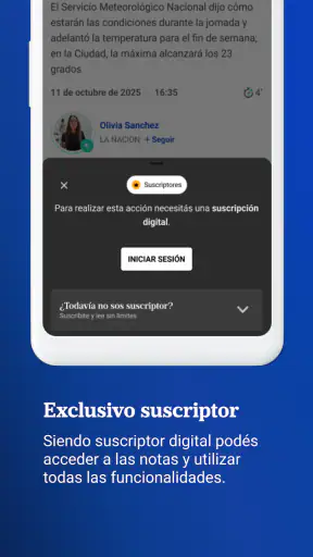
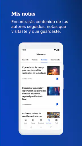
My biggest reservation is that directness should not be confused with personalization. A focused newspaper application can be easier to understand than an aggregator, but it may offer fewer ways to reshape the experience around a person’s exact needs. Someone who wants a carefully controlled list of subjects, a highly adjustable reading mode, or a single place for several publications may find the app restrictive.
Long-form reading can also be demanding for users with dyslexia, cognitive fatigue, or difficulty tracking lines of text. The best workaround is to use the phone’s available reading aids and take frequent breaks rather than forcing a long session. If the screen presentation does not work well with those tools, the browser version of the publication may be a better alternative for that individual. I would make this decision based on comfort, not loyalty to one format.
Navigation can become less comfortable when a user is trying to operate the phone with one hand. Tapping a headline is usually simple, but scrolling, returning, and changing the viewing position may require repeated movements. A stand, larger device, or voice-control features supplied by the operating system could make the routine easier. These are not special advantages of the app, but they are realistic ways to adapt it to a person’s physical context.
There is also a content-balance issue. A reader may enjoy having one trusted destination, yet relying on only one publication can narrow the range of perspectives encountered. I would use LA NACION as a primary source for its coverage while occasionally consulting other reputable outlets when a story is especially important, controversial, or personally relevant. That approach preserves the app’s convenience without asking it to do the job of an entire news ecosystem.
The rating gives a useful signal about its broad reception: it holds an average of 3.7 from around 14 thousand ratings, alongside more than 600 written reviews. I would not treat that figure as a final verdict, because people judge news apps according to changing expectations, phone models, reading habits, and their relationship with the publication itself. More than a number, it suggests that the experience is useful for many readers but not universally smooth.
Who should use it, and who should choose something else
I think LA NACION is a good fit for readers who already want this newspaper’s coverage, prefer a dedicated app over a browser, and value a quick route to current stories. It is also a sensible choice for people who want a simple, text-centered news routine rather than a social feed. The free price removes a financial barrier to trying it, and the Everyone age rating makes it suitable for a general audience.
Its established presence is clear from its release on April 27, 2012, and from having passed one million installs. Those figures do not guarantee that every screen will suit every person, but they show that this is not an experimental reader with no history. I would feel comfortable suggesting it to someone who wants to start with one recognizable news source and learn a repeatable reading habit.
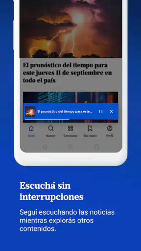
I would steer a different user toward an aggregator if they need several newspapers in one place, comparison between sources, or stronger control over topic filtering. I would also suggest trying the publication through a browser if the app’s text presentation does not cooperate with the person’s preferred accessibility settings. For someone who wants news delivered mainly through audio, this is unlikely to be the ideal first choice unless the phone’s own tools provide a comfortable solution.
Before settling on it, I recommend a short personal test. Open the app when you are relaxed, enlarge the text if needed, read one headline list and one full article, then return to the main screen. Notice whether the taps feel accurate, whether scrolling is tiring, and whether you can tell where you are without thinking about it. That test answers more than a generic promise of ease because accessibility is strongly shaped by the individual device and the reader’s abilities.
My inclusive verdict
After using it as a daily news destination, I see LA NACION as a focused and approachable option rather than a universal solution. Its strongest point is the clear relationship between the app and the newspaper: open it when you want LA NACION’s reporting, scan the available stories, and read what matters. That direct path can help people who dislike browser clutter, social distractions, or complicated news dashboards.
Its inclusive value comes from flexibility in how a person chooses to use it. A reader can make short visits, enlarge the phone’s text, lower the screen brightness, read one story at a time, and rely on operating-system accessibility tools. Those choices can make the experience work in more situations, from a quiet morning at home to a rushed midday check. At the same time, the app should not be presented as automatically accessible for every ability, because individual needs around vision, dexterity, concentration, language, and sensory comfort differ.
The best reason to install it is not that it promises to replace every news source, but that it can make one familiar source easier to reach. I would recommend it to readers who value that focused routine and are comfortable adapting the phone’s settings to their needs. I would skip it in favor of a broader aggregator, browser workflow, or audio-first option if customization, multiple perspectives, or a different sensory format is more important than direct access to LA NACION.


